TIP
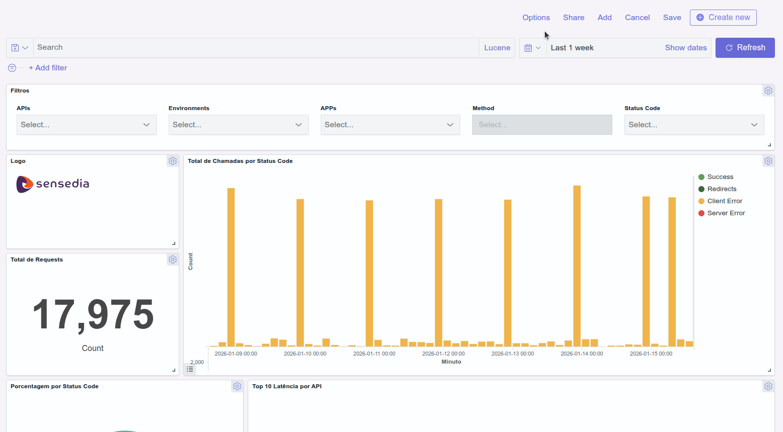
With Dashboards you can create customized panels with information that makes the most sense for you and your business.
Similar to the instrument panel of an airplane, Dashboards (available in English only) gather in only one place all key indicators so you can control and make decisions based on data.
Creating a dashboard
You don't have to start from scratch to create a dashboard. Just add what you had already created in Visualize, organize and save.
In order to create a Dashboard, follow the steps below:
Step 4
Select the visualization you want to add to the dashboard. You can use the search field to filter long lists. Click to add all the visualizations you want to use to compose your dashboard. When finished, click X, in the upper right corner or click outside this screen.
Step 5
You can arrange the panels with visualizations by resizing and dragging them. See below how to do this.
Step 6
Click Save at the top right of the screen. Write a title and description for your Dashboard. You can also activate the Store time with dashboard option so that the time range set when saving the Dashboard is restored each time it is loaded.
Watch the video showing an example on how to create a Dashboard:
Check also the video showing how to create visualizations.
Editing the dashboard
Follow the steps below to start editing a dashboard.
Step 2
Find the dashboard you want to edit and click the pencil icon.
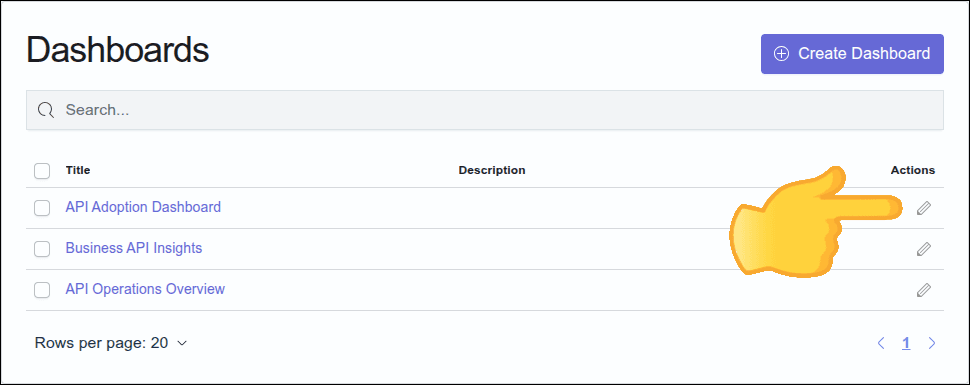
Alternatively, click the dashboard name. On the next screen, click the Edit button in the upper right area of the screen.
Step 3
From the edit screen you can:
- organize the panels containing the visualizations;
- create a new visualization and add it to the dashboard or add one of the visualizations that you had already created in Visualize;
- edit, duplicate, replace, or delete a panel with a visualization;
- add or remove margins between panels;
- add or remove titles from panels;
- share the dashboard and
- change the time range of the queries.
Arranging panels on your dashboard
Organize your dashboard by moving and resizing each visualization panel.
- Moving a visualization panel around
Step 1
Access the edit dashboard screen.
- Resizing a visualization panel
Step 1
Access the edit dashboard screen.
Creating or adding a visualization to the dashboard
You can always edit your dashboard including more visualizations, even creating new ones. To do so, follow the steps below:
Step 1
Access the edit dashboard screen.
Step 3
Follow the steps to create a new visualization. After clicking SAVE, enable the option Add to Dashboard after saving and click Save and return. The created visualization will be added to your dashboard.
- Add a visualization to the dashboard
Step 1
Access the edit dashboard screen.
Edit, duplicate, replace or delete a visualization from dashboard
- Edit a visualization
Even after adding and saving a visualization to your dashboard, you can edit it without having to go back to the Visualize screen. You can edit the settings for metric and bucket aggregations, edit labels, change filters, and more.
To edit a visualization, follow these steps:
Step 1
Access the edit dashboard screen.
Step 2
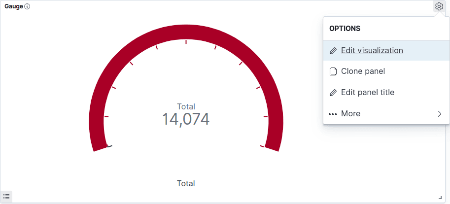
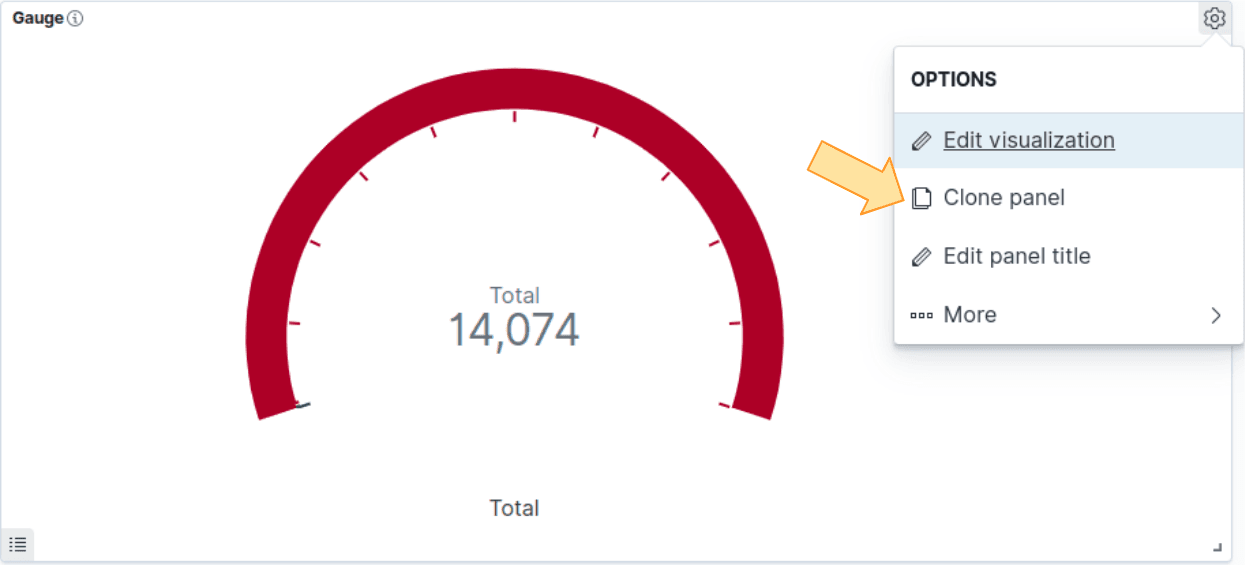
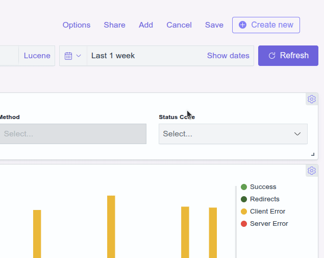
On the panel with the visualization you want to edit, click the gear icon to see the panel menu and then click Edit visualization, as shown in the figure below:
Step 3
Edit the visualization.
- Duplicate a visualization panel
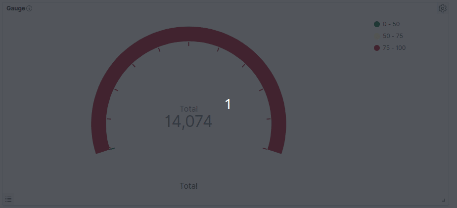
You can use the clone option to duplicate a visualization panel and its configured functionalities. You will have two identical panels (with the exception of the title) on your dashboard. This can be useful when you want to create a visualization that is similar to an existing one. Edit the cloned visualization, changing the title and other details.
To clone a visualization panel, follow the steps below:
Step 1
Access the edit dashboard screen.
- Replace a visualization
Follow the steps below to select a new visualization panel to replace the existing one:
Step 1
Access the edit dashboard screen.
- Delete a visualization
Follow the steps below to delete a visualization from your dashboard:
Step 1
Access the edit dashboard screen.
NOTEDelete from dashboard will only remove that visualization panel from your dashboard. Visualizations removed from the dashboard will still be available in Visualize.
Margins and titles
You can enable or disable design options to the entire dashboard, determining whether or not to set margins between visualization panels and to display the title of the visualization. For that, follow the steps below:
Step 1
Access the edit dashboard screen.
Sharing a dashboard
You can share your dashboard by either creating a direct link to it or a code to be added to your webpage.
Follow the steps below:
- iFrame code
Step 1
Access the edit dashboard screen.
Step 3
Select Embed code and specify how you want to generate the code:
- Snapshot: take and share a snapshot of the dashboard as it is at that moment. Edits made afterwards will not be updated in snapshot.
- Saved object: displays updates made to the dashboard, even if they are made after the code has been generated.
- Permalink
Step 1
Access the edit dashboard screen.
Step 3
Select Permalinks and specify how you want to create the link:
- Snapshot: take and share a snapshot of the dashboard as it is at that moment. Edits made afterwards will not be updated in snapshot.
- Saved object: displays updates made to the dashboard, even if they are made after the code has been generated.
NOTEAuthentication is required to access the shared dashboard.
Changing the time range
Even after adding visualizations with specific time ranges to your dashboard, you can still change that setting. Specifying a time range causes the data represented in the visualization to be updated to match the new settings.
To change the time range, follow the steps below:
Step 1
Access the edit dashboard screen.
Step 3
Choose from:
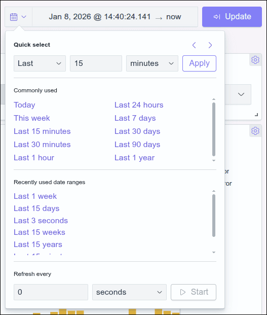
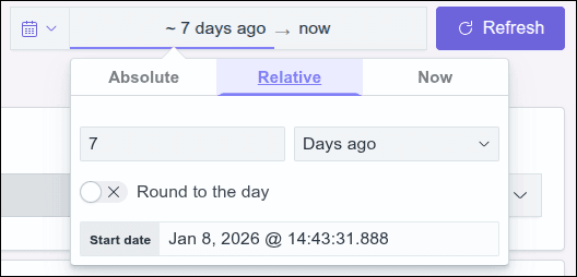
- Quick select: Set the time range based on the last or next number of seconds, minutes, hours, days, weeks, months or years. Click Apply after setting the new range.
- Commonly used: Select one of the preset options listed as frequently used.
- Recently used date ranges: Choose a previously used date range.
- Refresh every: Select this option and specify an automatic refresh rate. Enter the number and select from seconds, minutes or hours.
IMPORTANTThe minimum recommended time for refreshing (refresh every) Dashboards is 30 seconds.
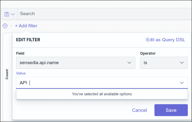
Using filters
Although you created each visualization with a specific filter, you can use additional filters that will be applied to all the visualizations that make up your Dashboard. To do so, follow the steps below.
NOTEFor the query to work properly, you must select the correct syntax (Lucene or DQL).
NOTEFor field values to be displayed in search autocomplete, they must reach a minimum volume of requests. If a value is changed, the new value will only start appearing in autocomplete after reaching this minimum volume again.
For example, if an API name is changed, the new name will only be suggested in autocomplete after a sufficient number of searches using this new value.
Deleting a dashboard
Follow the steps below to delete a dashboard.
Step 2
Locate the dashboard you want to delete by searching the list or typing its name in the Search field.
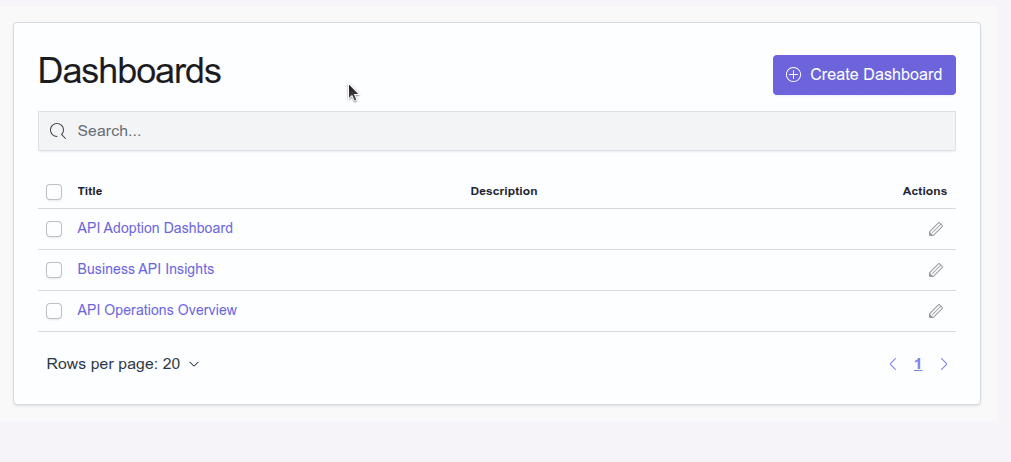
IMPORTANTDeleted dashboards cannot be recovered.